What if I told you there are no rules when it comes to color temperature?
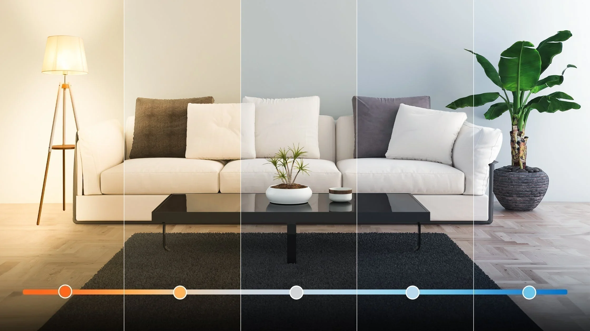
Image courtesy Feit Electric
Every designer on Instagram will tell you that it’s 2700K or nothing, but let me tell you a quick story about why we should be more sensitive in our lighting recommendations.
My uncle recently had cataract surgery. I saw him a couple of weeks after he recovered, and he told me something I found fascinating. After the surgery, his vision clarified significantly, but it also became cooler, not cooler like more popular at school, but cooler as in color temperature.
Like many aging people, he was experiencing yellowing of the cornea. This condition is common, and it starts gradually. You don’t wake up one morning with yellow vision; little by little, the yellowing takes over, and eventually it’s just the new normal. That is likely why your relatives of a certain age might like 5000K LEDs from Costco. They seem “brighter” to them even though they are creating the same amount of light as their warmer brethren.
For lighting designers, the hospitality trend is getting ever warmer. 2700K has given way to 2400K and even 1800K in some applications. For younger eyes, this might look like beautiful candlelight, or at least flatter certain skin tones. But to aging eyes (and even just people who don’t see quite the same way), this kind of lighting will feel painfully dark and brooding.
When designing for a commercial space like a restaurant, designers are often left to fulfill the owner’s vision. But if you’re working with a residential client, it’s their preferences that matter. Depending on their age and preferences, their preferred color temperature may depart from the beloved 2700K.
So I’ll leave you with one pro tip: always discuss color temperature with your client before you start specifying. I highly recommend getting a sample at that color temperature and using it on all the finishes you are considering for them. That light source might change how they feel about the finishes and save you from disasters.